9 tips to create better digital training courses
.png/fit-in/700x9999/filters:no_upscale())
When creating digital training courses, the key thing to do is focus on the needs analysis (why do we need training and who will be the learners). However, I always wondered if there’s a checklist to use to make sure we go in the right direction.
…Well there is one now! Keep reading to discover my 9 tips for creating better digital training:
- 3 tips at the beginning of the training,
- 3 tips throughout the training,
- and 3 tips at the end of the training.
At the beginning of the training
Before the learner starts learning, it’s critical to give them the motivation to take a course. Here are three actions that’ll help you make training appealing.
1. A short and catchy description
When you want to buy something online and you stumble across a seemingly good product. You want to know more about it so you try to read the description. But then you get frustrated as you notice that there’s no detailed information about the product's features.
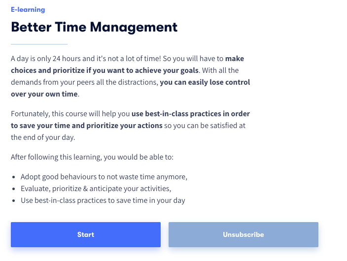
An example of a short, yet informative description of a course about time management.
When it comes to training designs, it’s kind of the same. A description should allow the learners to have a better understanding of the training’s content but also to know what are the outputs of the training.
For this, there is nothing better than specifying learning objectives, designed by Bloom’s taxonomy.
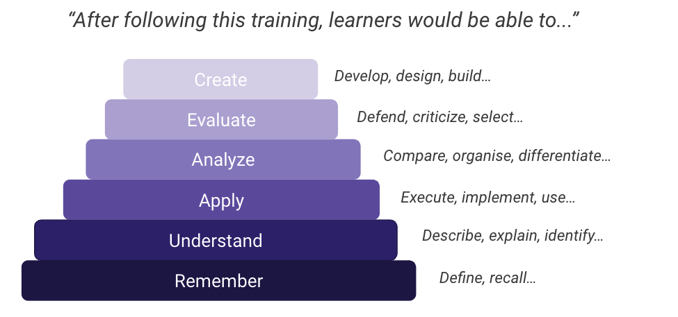 Using the Bloom taxonomy to set your learning objectives.
We must be careful that learning objectives are realistic. If the training course only contains a two-minute video, it’s not realistic to expect learners to agree with far-fetched learning objectives. One course does not an expert make…
2. An attractive cover image
When you’re on YouTube, what makes you click on a video instead of another? There is obviously the title, but it’s not the only element!
The cover image is an image that would catch the attention and give a lot of information about your training. A good cover image would imply the training is good too.

A cover image by GoodHabitz (partner of myskillcamp): it’s simple, yet colourful, catchy and neat.
But no stress, it’s not necessary to master Photoshop to design appealing cover images. Using Canva with all its templates would allow you to create beautiful images in less than 15 minutes!
Therefore, taking a simple photo on Pexels or Unsplash won't be sufficient!
3. A video teaser
The best way to know if a new movie would please us, is to watch the trailer (which is basically a teaser)!
Using this technique may improve learners’ interest.
One partner that we love for this at myskillcamp is Kokoroe. At the beginning of each Kokoroe course, you’ll find a small 30 second video teaser.

One scene of a video teaser from a training about Intercultural Management from Kokoroe
And it’s pretty efficient because many times, learners want to know more and continue the course.
To quickly create video teasers, Lumen 5 or Canva would probably be the best tools with their numerous templates available.
Throughout the training
After the learners have started the course, it’s key to keep them engaged throughout the learning experience. Here are three tips that will help you.
4. A balanced and clear structure
One driver that we have as human beings is that we like to have a feeling of progression. If learners don’t feel like they are progressing, they are more likely to give up.
That’s why having a clear structure in your digital training course is important. Couple this with using micro-learning concepts so the progression is quick and easy to quantify.
To structure your training course, use our Learning Plan to ensure you cover all relevant topics and you make it seamless for learners.
5. Learning activities that fit the 2D feedback rule
Learning activities (quiz, projects…) are key so your learners are more active in their journey. I think we all know that.
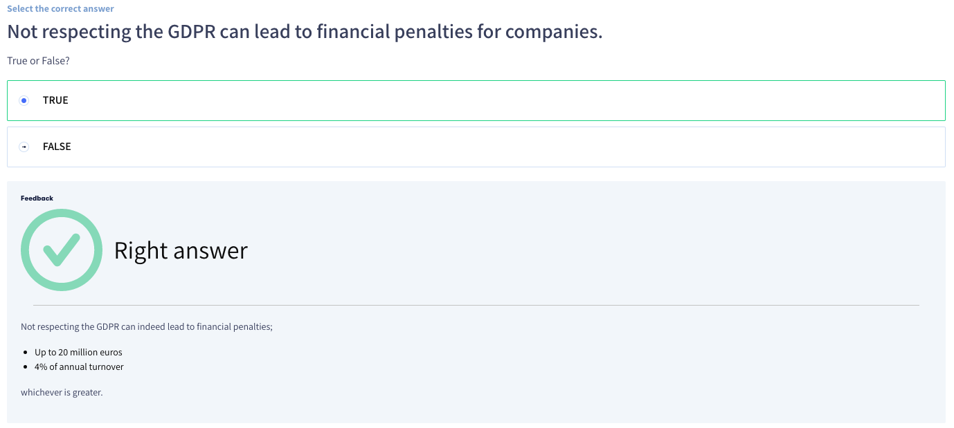 Feedback here is differentiated and detailed in this course about GDPR
I want to insist on what I called the 2D principle when it comes to feedback in learning activities:
- Differentiated: it’s key to let each learner know if they succeeded or not in the learning activities. For instance, if the learner has a correct answer to a quiz or not. Many times, we don’t know and that’s frustrating!
- Detailed: A common frustration when following a digital training course is to be wrong for a learning activity but it’s not possible to see where the mistakes are and how I can prevent from doing them again. That’s why it's key to give detailed feedback with links to dive deep for instance.
6. Diversity in content format
The common belief is that we all have a learning style. However, that's not 100% true. What we have is learning strategies. Also as a learning designer, our responsibility is to stimulate learners so they can use their learning strategies. Therefore, they can memorise the content easily.
One way to do so is to diversify the format of the content you have so you keep the learners’ attention throughout the learning journey. To do so, use the power of learning curation to quickly find diversified pieces of content.
At the end of the training
7. A questionnaire to assess reaction
You’ve spent a lot of time designing a training course. But it’s key to assess how the learners have reacted to this training. What will they remember from the training? What did they like the most from the training?
It’s time to ask them so you can actually measure quantitative measurements like course satisfaction which is the first level of the Kirkpatrick model.
But you will be able to gather qualitative insight too, so you can improve future courses.
A simple questionnaire on Google Forms would be perfect. But guess what? You don’t really have to do anything for that because we provide you with a template you can use at the end of each of your courses!
8. A key take away
Following a course is great, then the next step is to actually make something out of it. So learners have to use what they’ve learned. For that, it depends on each individual. However, one way to make it easier for the learners as a learning designer is to give them something they can refer to after the training.
Creating a key take away that the learner can save or print at the end of the training with the main key topics covered during the course is the way to go.
One myskillcamp partner is giving key take-aways at the end of each of its training sessions, XOS. The design is simple but it’s something that you can go back to easily without taking the whole training again.
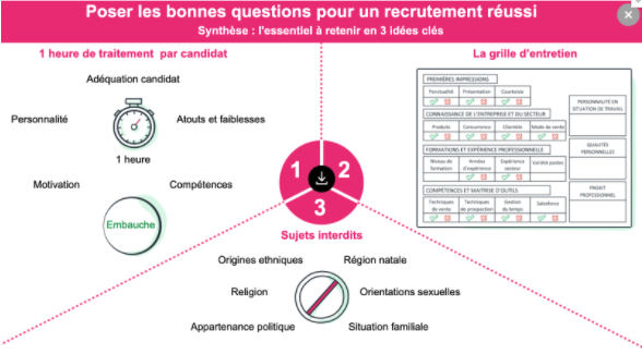
Sorry for my French… a key take away that XOS, a French content provider, gives at the disposal of the learners every time.
9. A certificate to show success
Once the learners have completed training, one good way to praise them is to generate a certificate they can add to their collection. It can be quite tricky because it’s something you want to automate so you don’t spend one day per week creating certifications.
With the myskillcamp authoring tool you can actually personalise certificates for each course and it’s a lot quicker.
Do what I say, and what I do too :PI will apply one of the tips mentioned in this article by giving you a key take away that you can save. This is so you can keep it near when designing your future digital training courses!

Learning Content Advisor, myskillcamp


)
)
)
)
)
)
)
)
)
)
)
)
)
)
)
)
)
)
)
)
)
)
)
)
)
)
)
)
)
)
)
)